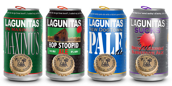
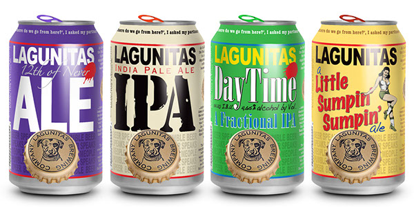
LAGUNITAS CANS
personal project
Evolving a brand through new packaging.
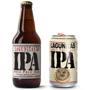
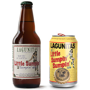
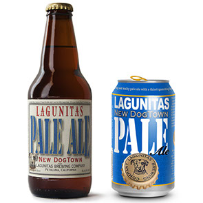
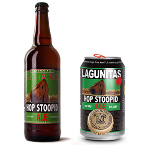
I'm a big fan of the Lagunitas Brewing Company and have been visiting the brewery and following the company in the news ever since I first moved to the Bay Area. When they partnered with Heineken in 2015 I knew they'd eventually end up canning their beers and was interested in how they'd use that opportunity to evolve the brand.
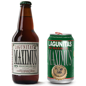
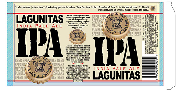
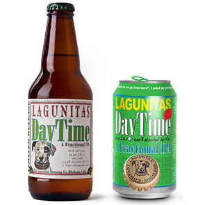
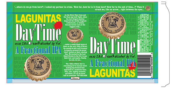
In May of 2016 a black and white version of the flat artwork file for their first canned beer was leaked to mybeerbuzz and some color mock-ups soon followed. I decided to use those files as a template for creating can designs for some of my favorite Lagunitas beers.
I started by recreating the flat artwork file in Illustrator, then pulled artwork from Lagunitas' online artwork archive and dug around some typography forums until I found an archive of fonts from a dead type foundry that included all the vintage fonts Lagunitas used for their bottle labels in the late 90s. While I was at it I also took their current messy vector/raster logo and re-drew the dog so I could convert it to an infinitely scalable vector file.
I had a lot of fun doing the research for this project and recreating each label design in a way that both matched the new can format but was still recognizable as the original beer and maintained the off-kilter look and feel of the Lagunitas designs.
